Example Domain
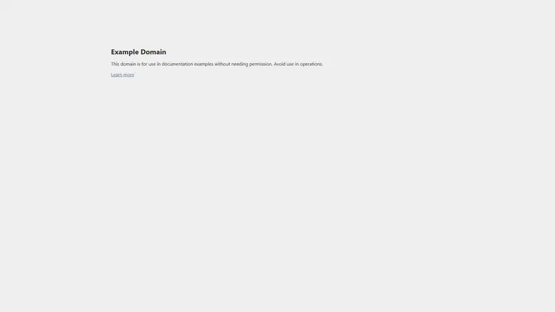
Desktop · Light · scroll within frame to see full page
Design System Inspiration
example.com — extracted via DESIGN.md
Other · Placeholder and Documentation
Typography
system-ui
Heading
Color palette
TL;DR
The example.com design system is a study in functional minimalism, prioritizing legibility and structural clarity over decorative flair. The interface relies on a pure white background (#ffffff) and absolute black text (#000000) to establish a 21:1 contrast ratio for core content. A specific slate-blue (#334488) is reserved exclusively for interactive text elements, serving as the system's only chromatic signal. Typography is strictly system-ui, utilizing bold weights (700) for headers and regular weights (400) for prose, while layout is governed by a rigid 8px base unit.
Target audience
Developers and designers looking for a reference implementation of a standard, no-frills informational landing page.
Brand Voice
Functional, neutral, and strictly utilitarian.
Positioning
A placeholder utility for technical writers and developers. It provides a safe, permission-free space for illustrative examples in documentation.
Voice principles
- —Utilitarian: Focuses entirely on the purpose of the asset with zero decorative language.
- —Neutral: Maintains a clinical, objective stance that avoids personality or brand flair.
- —Instructional: Uses clear, declarative sentences to define usage and boundaries.
- —Transparent: Explicitly states what the user can and cannot do to ensure compliance.