Homepage - TELL Japan
Desktop · Light · scroll within frame to see full page
Design System Inspiration
Telljp — extracted via DESIGN.md
Non-profit · Mental health support
Typography
Roboto Slab
Heading
Open Sans
Body
Color palette
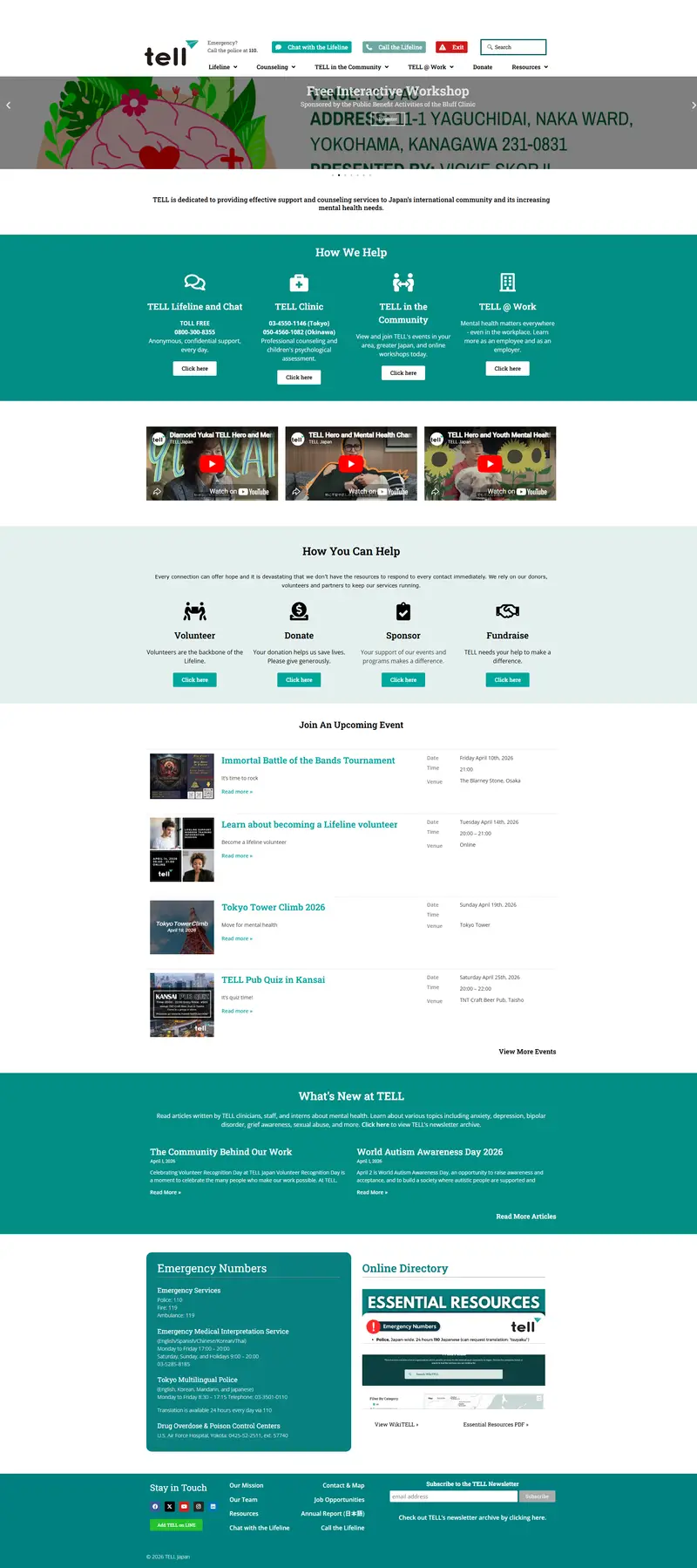
TL;DR
Telljp utilizes a high-contrast palette of deep teal (`#008080`), primary teal (`#00a79d`), and pure white to establish a professional yet accessible healthcare environment. The typography is dominated by **Roboto Slab**, providing a sturdy, trustworthy foundation for headings and interactive elements, while **Open Sans** handles dense informational body copy. Layouts rely on alternating full-width color bands to separate service categories, using a consistent 4px border radius for interactive components. The system prioritizes legibility and clear action paths through high-contrast button states and a strictly organized informational hierarchy.
Target audience
The site likely targets professionals or individuals interested in Japanese culture, business, or design, seeking high-quality content presented in a refined and modern digital environment.
Full tech stack
Analytics
Brand Voice
A calm, urgent, and supportive lifeline that prioritizes immediate safety and community connection.
Positioning
TELL is a mental health support provider for Japan's international community, offering anonymous crisis support, professional counseling, and community events. It serves as a bridge between English-speaking residents and critical mental health resources.
Voice principles
- —Urgent and Direct: Prioritizes immediate action for safety, using imperative verbs for emergency instructions.
- —Supportive and Hopeful: Uses warm, human-centric language to emphasize that every connection matters and help is available.
- —Transparent and Professional: Clearly states the nature of services (anonymous, confidential) and provides specific, localized contact data.
- —Community-Oriented: Focuses on collective effort, highlighting volunteers as the "backbone" and inviting participation through events.