Spark xyz
Video · Light
Design System Inspiration
Sparkxyz — extracted via DESIGN.md
Other · Startup ecosystem platform
Typography
Inter-UI-Regular
Heading
Ilisarniq-regular
Body
Color palette
TL;DR
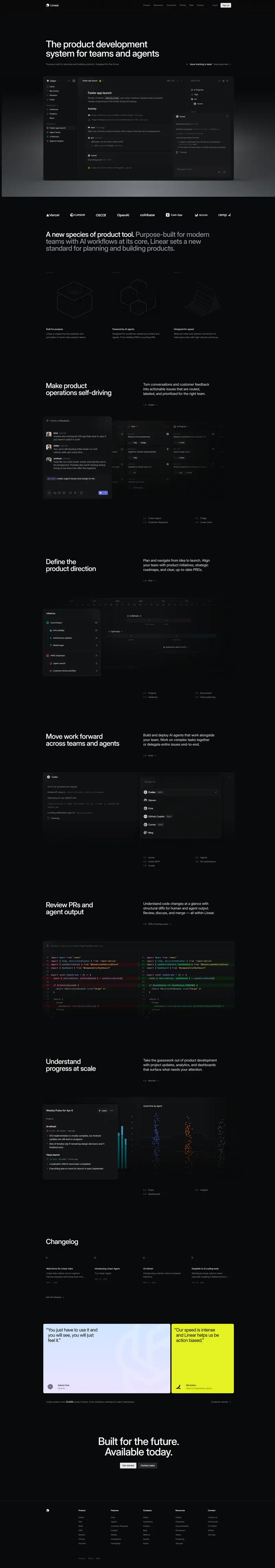
Sparkxyz utilizes a professional "monochrome-plus" system where a deep navy foundation `#081445` provides structural authority against a clean white `#ffffff` canvas. The system injects energy through a primary brand blue `#4b68ea` and a secondary functional orange `#f6ad55`, primarily used for high-conversion CTAs. Typography is split between the geometric, friendly **Ilisarniq-regular** for headings and the highly legible **Inter-UI-Regular** for functional body text and interface elements. Components favor soft geometry with a mix of 8px, 28px, and full pill-shaped radii, often supported by deep, soft shadows for elevation.
Target audience
The site is likely targeting startups, tech companies, or professional service providers looking for a modern, sophisticated, and user-friendly platform to showcase their offerings.
Full tech stack
Analytics
Brand Voice
Functional, efficient, and occasionally colloquial, prioritizing utility and speed for the venture ecosystem.
Positioning
Sparkxyz is an end-to-end backend system and platform that connects founders to funding sources. It serves startups, investors (VCs, Angels, Incubators), and competition organizers by digitizing deal flow and administrative processes.
Voice principles
- —Utility-focused: Uses action-oriented verbs to describe specific software capabilities.
- —Direct: Employs short, declarative sentences that minimize fluff and maximize clarity.
- —Modern/Casual: Occasionally uses internet-native shorthand to signal speed and ease of use.
- —Comprehensive: Positions the product as a "turn-key" or "entire" solution that covers the full lifecycle of a deal or competition.