ReadyWhen
Video · Light
Design System Inspiration
Readywhen — extracted via DESIGN.md
Legal · Digital estate planning
Typography
roboto
Heading
FontAwesome
Body
Color palette
TL;DR
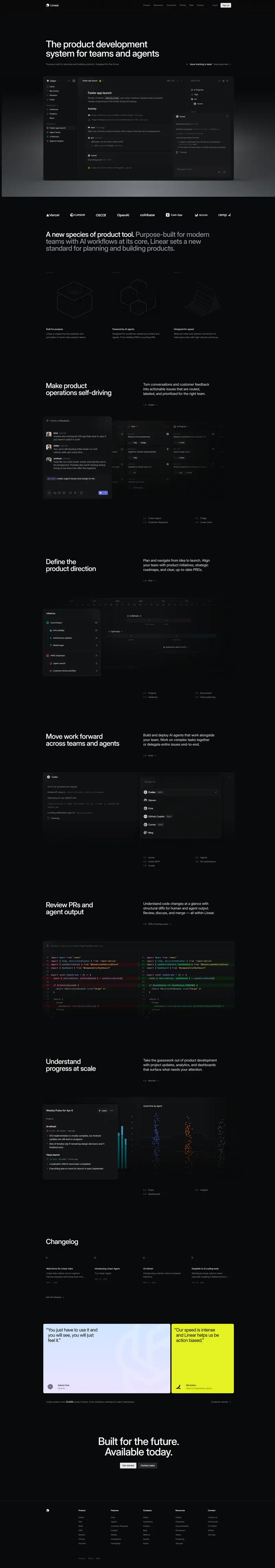
Readywhen utilizes a high-clarity, monochrome-adjacent system where **Teal (#10b8aa)** acts as the sole chromatic driver for actions and brand identity. The interface relies on a stark white foundation (#ffffff) punctuated by a very light **Mint Wash (#e6f8f6)** used for full-width section backgrounds to create rhythmic pacing. Typography is strictly **Roboto**, favoring weight 700 for large display headers and weight 400/500 for a multi-tiered gray scale (#454545, #757575). Components are characterized by sharp or very minimal radii (3px-5px), avoiding the pill-shaped trends of modern SaaS for a more structured, document-like feel.
Target audience
The likely target audience is individuals and families seeking a secure and straightforward digital solution for estate planning and management.
Full tech stack
Analytics
Meta description
Don't leave life planning to the last second. Welcome to ReadyWhen - simple, secure, and fast digital estate management
Brand Voice
A proactive, reassuring, and practical guide for managing the inevitable with clarity.
Positioning
ReadyWhen is a digital legacy management platform designed for individuals and families to organize assets and estate plans. It serves as a secure bridge between current life planning and future execution for loved ones and professionals.
Voice principles
- —Proactive: Focuses on taking action now to prevent future chaos.
- —Empathetic but Grounded: Acknowledges the "inevitable" and "emotional" nature of death without being overly sentimental or morbid.
- —Clear and Direct: Uses simple language to explain complex legal or financial concepts like probate and estate planning.
- —Urgent: Gently nudges the reader to act because "life is unpredictable."