Hopin is now RingCentral Events
Video · Light
Design System Inspiration
Hopin — extracted via DESIGN.md
Communication · Event management platform
Typography
Matter
Heading
Color palette
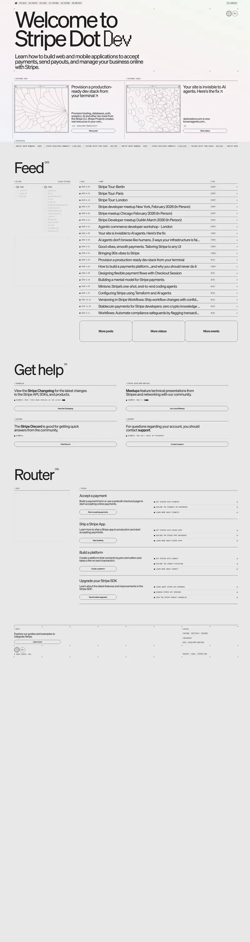
TL;DR
The Hopin design system (now transitioning to RingCentral Events) is a high-clarity, monochrome-leaning system that uses **RingCentral Blue** (#007db8) as its primary functional anchor. The interface is characterized by a clean white canvas (#ffffff) and deep charcoal text (#0e0f12), creating a professional, high-contrast environment. Visual interest is introduced through large-scale geometric "pill" containers with generous 16px to 30px radii and soft peach-to-white gradients in testimonial sections. Typography is exclusively **Matter**, utilizing a semi-bold weight (600) for display headers to maintain a friendly but authoritative corporate presence.
Target audience
The site targets event organizers and businesses seeking a robust platform for virtual and hybrid events, focusing on brand engagement and community building.
Full tech stack
Analytics
Meta description
Run engaging webinar and event experiences that reflect your brand, build community, and create a lasting impression on your audience.
Brand Voice
Professional, community-focused, and high-impact.
Positioning
RingCentral Events is an all-in-one virtual event platform for marketing teams and businesses. It enables organizations to host engaging, studio-quality video experiences that build community and drive business growth.
Voice principles
- —Action-Oriented: Uses strong verbs like "Power," "Build," and "Run" to emphasize results.
- —Community-Centric: Focuses on the human element of technology through terms like "Authentic connection" and "Global interaction."
- —Professional and Scalable: Maintains a sophisticated tone that appeals to "innovative marketing teams" and global enterprises.
- —Direct: Uses short, punchy sentences to convey value quickly without fluff.