HAPP
Video · Light
Design System Inspiration
Happ.jobs — extracted via DESIGN.md
HR · Job matching
Typography
Roboto
Heading
Jost
Body
Color palette
TL;DR
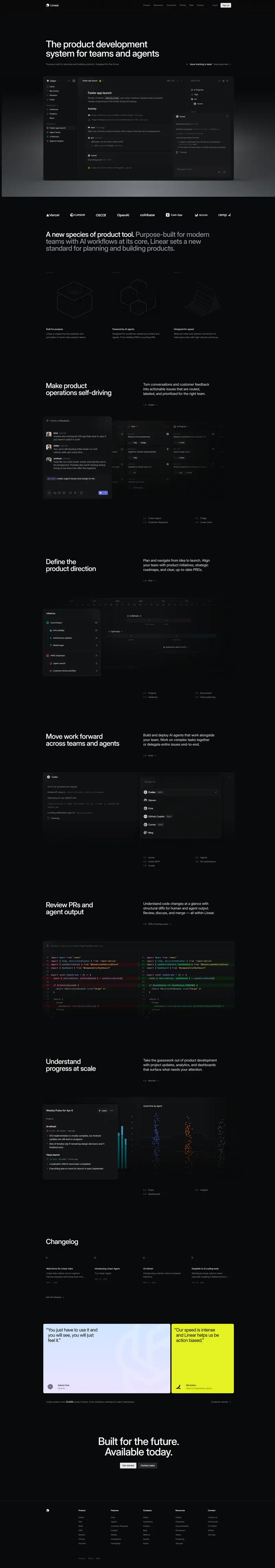
Happ.jobs utilizes a "Professional Cobalt" aesthetic, anchoring a pure white foundation `#ffffff` with a primary action color of `#2e3be3`. The system relies on high-contrast typography using **Poppins** for bold, impactful displays (55px) and **Jost** for functional UI elements and subheadings. Depth is achieved through a specific "Soft Float" shadow `rgba(0, 0, 0, 0.1) 0px 11px 33px 0px` applied to cards with generous 16px to 32px radii. The layout is spacious, utilizing a custom spacing scale that emphasizes 32px and 48px gaps to maintain a clean, accessible recruitment interface.
Target audience
The target audience is job seekers looking for a simplified and efficient way to find employment without traditional job searching, appealing to those who appreciate modern and clean digital interfaces.
Full tech stack
Analytics
Brand Voice
Effortless, supportive, and efficient, acting as a proactive partner that removes the labor from employment.
Positioning
HAPP is an automated career assistant for job seekers that replaces traditional searching and applying with a hands-off, AI-driven matching service. It positions itself as a stress-free alternative to the manual grind of the modern job market.
Voice principles
- —Effortless: Focuses on the lack of work required by the user, using simple verbs and emphasizing ease.
- —Proactive: Speaks as an active agent (the "assistant") that does the heavy lifting while the user remains passive.
- —Reassuring: Uses a supportive tone to reduce the anxiety of unemployment, emphasizing "stress-free" experiences and "trusted" partners.
- —Hybrid: Balances technical efficiency with personal care, specifically highlighting the blend of AI speed and human support.