CapSource – Experiential Learning Made Easy
Video · Dark
Design System Inspiration
Capsource — extracted via DESIGN.md
Education · Experiential learning platform
Typography
Avenir-Book
Heading
w-e-icon
Body
Color palette
TL;DR
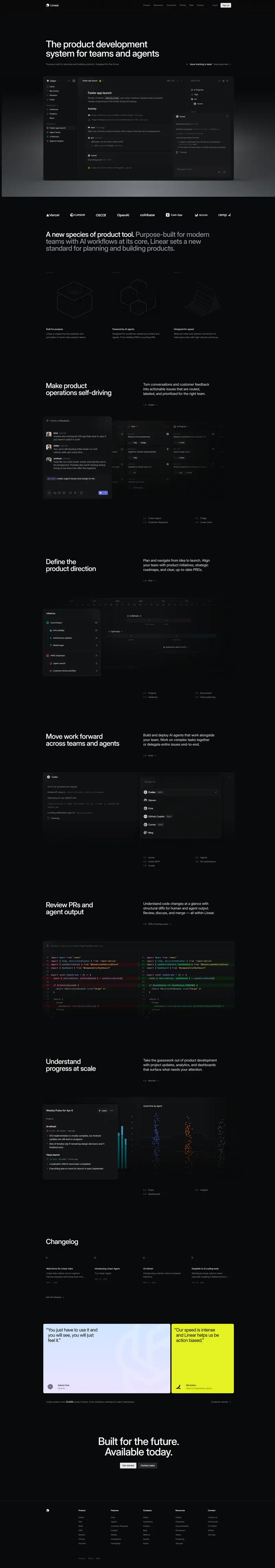
Capsource utilizes a high-energy monochrome base, relying on pure white (#ffffff) and soft gray (#f3f3f3) surfaces punctuated by a signature orange (#f7931d) accent. Typography is strictly Avenir-Book, ranging from massive 60px display headers to highly legible 16px body text, maintaining a professional yet accessible educational aesthetic. The system favors extreme rounded geometry, with buttons and cards often utilizing 99px or 50px radii to create a "pill" or "bubble" motif. Layouts are characterized by generous vertical spacing (up to 113px) and a distinct "dot grid" decorative pattern used in hero backgrounds.
Target audience
The site targets educational institutions and businesses interested in experiential learning solutions, seeking a professional and easy-to-navigate platform.
Full tech stack
Analytics
Brand Voice
Professional, collaborative, and results-oriented with a focus on bridging education and industry.
Positioning
CapSource is an experiential learning and hiring platform that connects educators, students, and industry partners. It provides the technology and framework to design, manage, and scale project-based learning and real-world case studies.
Voice principles
- —Empowering: Uses active verbs to encourage users to build, scale, and explore.
- —Professional: Maintains a serious, business-like tone suitable for academic and corporate stakeholders.
- —Collaborative: Emphasizes the connection between different groups (students, educators, and partners).
- —Scalable: Focuses on high-impact solutions that work for large communities and institutions.