CapsicoHealth
Video · Light
Design System Inspiration
Capsicohealth — extracted via DESIGN.md
Healthcare · Precision care intelligence
Typography
FontAwesome
Heading
Poppins
Body
Color palette
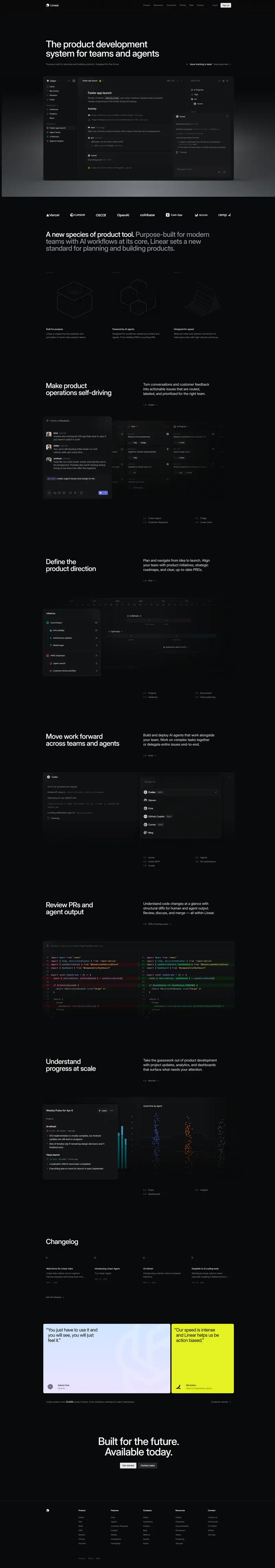
TL;DR
Capsicohealth utilizes a structured, high-contrast layout that balances a clinical white foundation (`#ffffff`) with a deep, authoritative forest green (`#003f24`) in the footer and primary brand elements. The system is typography-heavy, relying on the **Poppins** family to establish a clear hierarchy from 46px display headers down to 14px utility text. UI elements are characterized by generous 25px corner radii on cards and a significant 100px vertical rhythm between major sections. While the system is technically monochrome in its parent structure, it allows for specific accent colors like a deep indigo (`#330099`) and slate blue (`#2c2d3f`) for text-based emphasis.
Target audience
The site targets healthcare professionals, investors, and potential partners interested in data-driven precision care solutions.
Full tech stack
Meta description
Driving Intelligence for the Future of Health
Brand Voice
Professional, analytical, and authoritative, focusing on the intersection of advanced AI and clinical outcomes.
Positioning
CapsicoHealth provides a Gen-AI and LLM platform for Life Sciences and healthcare enterprises. It uses real-world data and agent-driven workflows to optimize patient journeys, improve treatment response, and drive growth in precision medicine.
Voice principles
- —Data-Centric: Uses specific metrics and technical terminology to establish credibility.
- —Problem-Oriented: Clearly identifies industry "problems" or "complex challenges" before presenting the platform as the solution.
- —Academic and Clinical: Employs formal language suitable for research initiatives and prestigious medical partnerships.
- —Direct: Uses declarative statements to describe capabilities and market leadership without excessive marketing fluff.