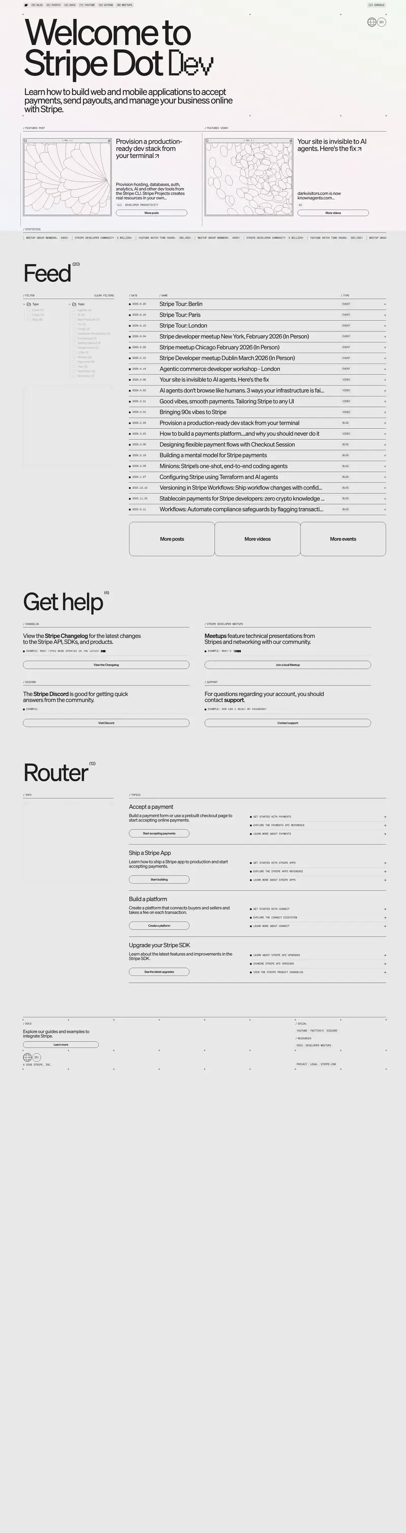
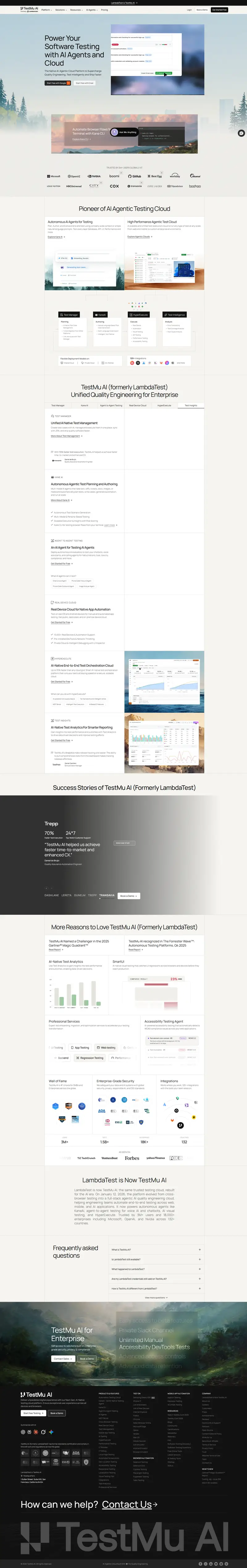
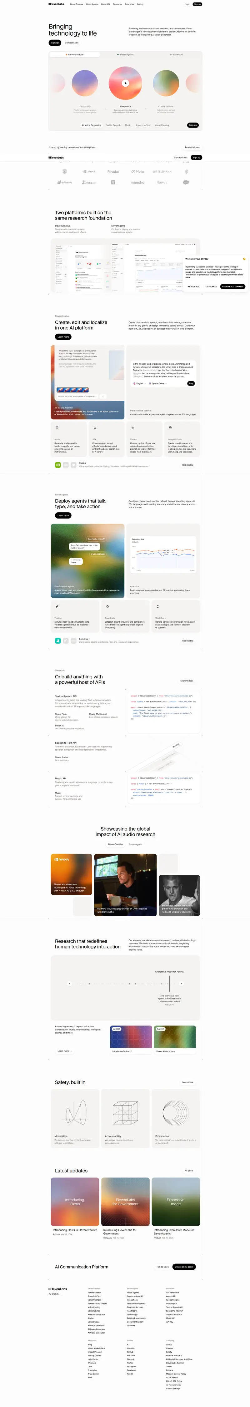
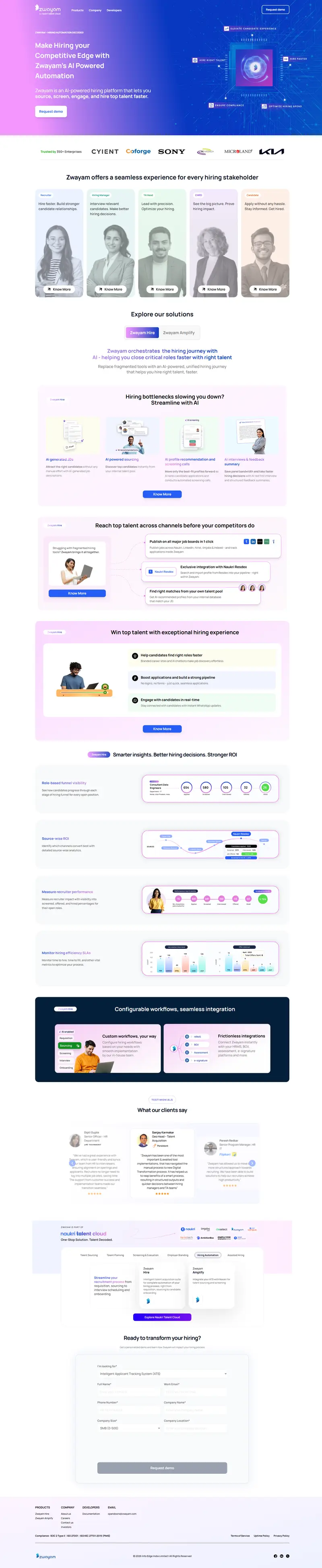
Home - Qualsoft - Edtech & Software Solutions
Video · Dark
Design System Inspiration
Qualsofttech — extracted via DESIGN.md
Education · Edtech solutions
Typography
Roboto
Heading
Roboto Slab
Body
Color palette
TL;DR
Qualsofttech utilizes a high-voltage "Vivid Cyan Blue" (#009cff) as its primary functional and brand color, contrasted against a clinical white (#ffffff) canvas. The typography is dominated by **Roboto**, used at significant weights (600) and large scales (50px+) for display headers, while **Roboto Slab** provides a more traditional serif counterpoint for specific UI labels. The system is strictly geometric, favoring 0px border radii for most containers and sections, punctuated by rare 50px rounded panels or circular icons. Layouts are dense, using a 20px base spacing unit to organize complex enterprise information.
Target audience
The site targets businesses and educational institutions seeking professional EdTech and software solutions, appealing to decision-makers who value clean design and clear information.
Full tech stack
Brand Voice
Professional, enterprise-focused, and technically authoritative with a focus on educational transformation.
Positioning
Qualsoft is an IT solution provider and ISO-certified consultancy specializing in AI-based ERP systems (QualCampus) for schools and colleges. They position themselves as a high-level partner for digital transformation, custom software development, and biometric integration.
Voice principles
- —Authoritative: Uses industry-standard terminology and certifications (ISO 9000:2003) to establish immediate credibility.
- —Functional: Focuses on utility and outcomes, prioritizing what the software "manages" or "simplifies" over abstract emotional appeals.
- —Academic: Maintains a formal tone appropriate for its primary audience of school administrators, teachers, and educational institutions.
- —Direct: Uses clear, declarative sentences to describe services and leadership backgrounds without excessive marketing fluff.