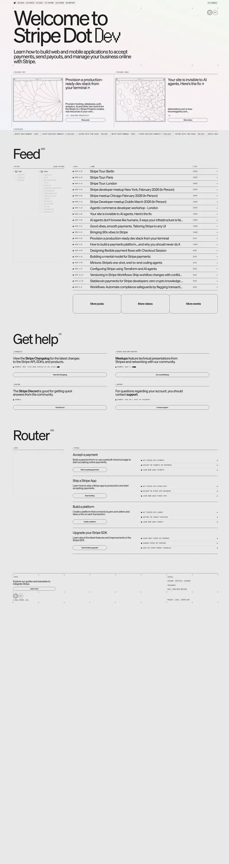
PowerReviews: Doing More with UGC to Grow Your Business
Video · Light
Design System Inspiration
PowerReviews — extracted via DESIGN.md
E-commerce · UGC & Reviews
Typography
Moderat
Heading
Arial
Body
Color palette
TL;DR
PowerReviews utilizes a "monochrome-plus" strategy where a stark black (#000000) and white (#ffffff) foundation provides the structural frame for high-energy color bands. The system is anchored by the geometric sans-serif **Moderat**, used at heavy weights (700-900) for display and light weights for body. Primary actions are consistently rendered as black pill-shaped buttons with white text, while secondary accents like teal (#167f9c) and lime green appear in specific product-demo or testimonial contexts. Layouts rely on sharp 0px corners for containers, contrasted against 999px pill radii for interactive elements.
Target audience
The target audience is businesses and e-commerce managers looking to leverage user-generated content for growth and improved product positioning.
Full tech stack
Analytics
Meta description
Collect more and better Ratings & Reviews and other UGC. Create UGC displays that convert. Analyze to enhance product experience and positioning.
Brand Voice
Professional, growth-oriented, and authoritative, focusing on the tangible business outcomes of user-generated content.
Positioning
PowerReviews is a conversion-first UGC vendor and ratings specialist for brands and retailers. It positions itself as a strategic partner that uses data and expert support to maximize sales and continuous business improvement.
Voice principles
- —Result-Oriented: Focuses heavily on the "why" and the outcome, specifically growth, conversions, and ROI.
- —Specialist: Uses industry-specific terminology (UGC, Syndication, NLP) to establish deep domain expertise.
- —Direct: Employs short, punchy imperatives and active verbs to drive action.
- —Supportive: Balances technical power with a human element, emphasizing guidance, success stories, and partnership.