Electude - See it. Try it. Get it.
Desktop · Light · scroll within frame to see full page
Design System Inspiration
Electude — extracted via DESIGN.md
Education · Automotive e-learning
Typography
InterTight
Heading
Arial
Body
Color palette
TL;DR
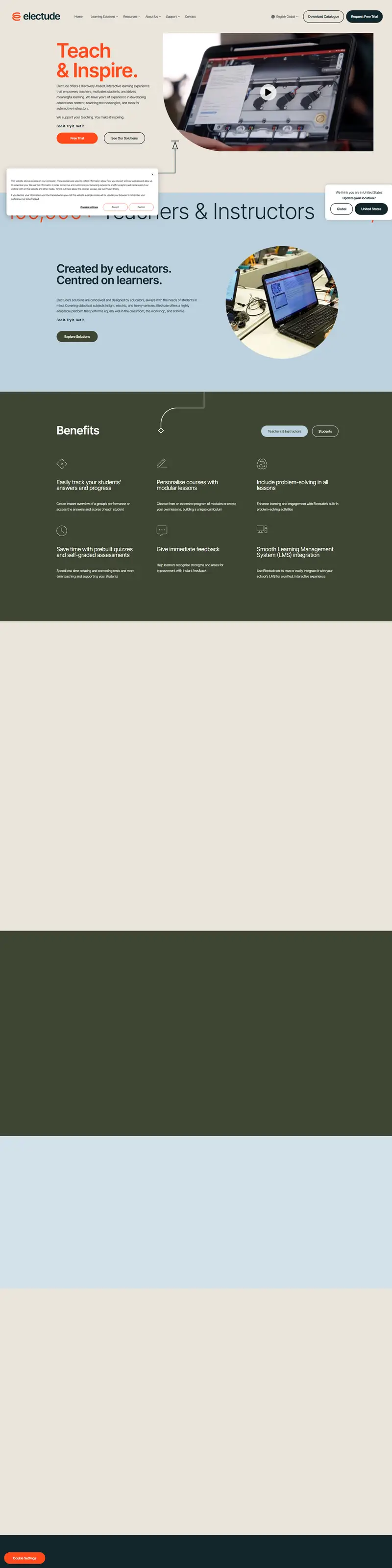
Electude utilizes a high-contrast "monochrome-plus-accent" system. The interface is anchored by a deep near-black green `#11262b` (Brand 5) used for primary text and backgrounds, contrasted against a warm off-white foundation `#ebe4db` (Brand 2). A high-saturation orange `#ff491c` (Brand 1) serves as the primary action signal, appearing in CTAs and critical headings. The typographic signature is **Inter Tight** at an exceptionally light weight (300) for display headers, often reaching sizes of 106px. Component geometry is characterized by extreme pill-shaped rounding (100px) for interactive elements, while structural containers remain sharp (0px).
Target audience
The target audience is likely automotive teachers and technical students seeking an interactive and engaging e-learning platform.
Full tech stack
Analytics
Meta description
A discovery-based, interactive learning experience that empowers automotive teachers, motivates technical students, and drives meaningful learning.
Brand Voice
Practical, encouraging, and authoritative, speaking as one educator to another.
Positioning
Electude is a discovery-based, interactive learning platform for technical and automotive education. It is designed by educators to help instructors automate assessment and inspire students through modular, simulation-based content.
Voice principles
- —Empowering: Focuses on supporting the teacher's role rather than replacing it.
- —Action-Oriented: Uses short, punchy imperatives that emphasize the ease of use.
- —Pedagogical: Employs professional educational terminology to establish credibility with academic institutions.
- —Direct: Uses simple sentence structures to convey efficiency and clarity.