Deanta
Video · Light
Design System Inspiration
Deanta — extracted via DESIGN.md
Media · Publishing solutions
Typography
Roboto
Heading
ITCAvantGarde
Body
Color palette
TL;DR
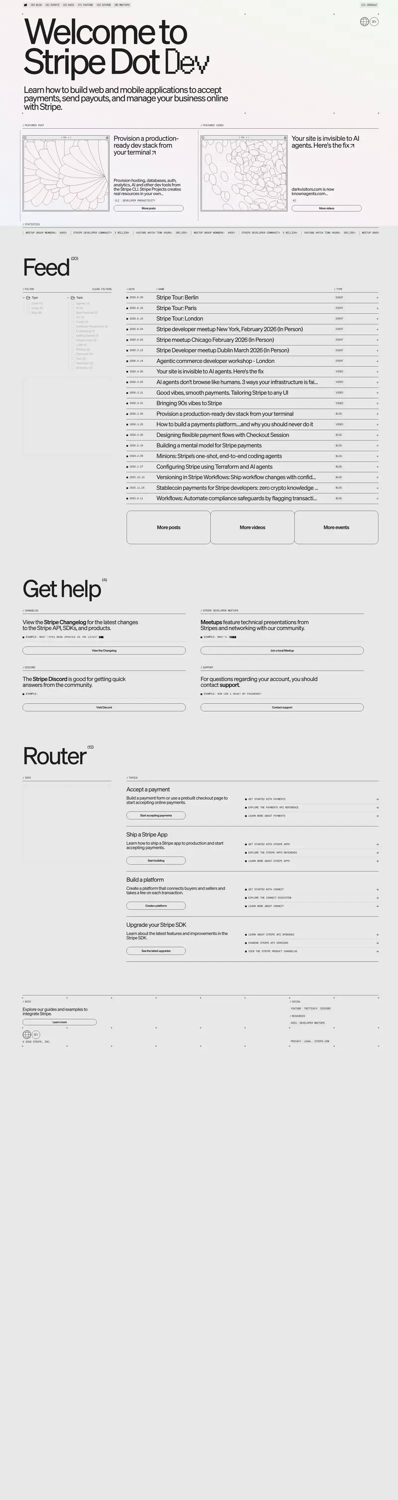
Deanta employs a "monochrome-plus" system where a stark white canvas (#ffffff) is anchored by deep navy (#074973) and slate (#363e44) blocks. The typography is the primary brand carrier, utilizing **ITCAvantGarde** in heavy weights (700-900) for display and **Roboto** (300) for a light, technical body feel. The system is strictly geometric, featuring a universal border radius of 0px across all cards, buttons, and sections. Visual rhythm is driven by large-scale display type (54px) and a distinct "diagonal slash" decorative motif that intersects section headers.
Target audience
The target audience consists of professionals and organizations in the publishing industry seeking advanced and efficient content management solutions.
Full tech stack
Analytics
Brand Voice
Professional and tech-forward, yet grounded in approachable, human personality.
Positioning
Deanta provides technology-led production services and software licensing for academic and book publishers. They position themselves as a consultative partner that transforms the production process through a blend of high-level expertise and "nice people."
Voice principles
- —Expert but Approachable: Uses industry-specific terminology (typesetting, author management, front list growth) while maintaining a friendly, "human" persona.
- —Solution-Oriented: Focuses on the outcome of the work, such as "transforming product" or "addressing critical needs," rather than just the tasks themselves.
- —Confident and Established: Leverages a clear timeline of growth and a "deep-rooted" network of consultants to signal reliability.
- —Direct: Uses active verbs like "License," "Maintain," and "Enjoy" to present clear calls to action and benefits.